The focus in this micro UX case study is performing a brief heuristic evaluation and highlighting evident items for improving the overall experience by uncovering potential areas for making the product better with minimum effort.
The scope of this micro UX case study is to explore avenues for improving the experience on the mobile.de app for iOs devices.
Improving app notifications
Insights
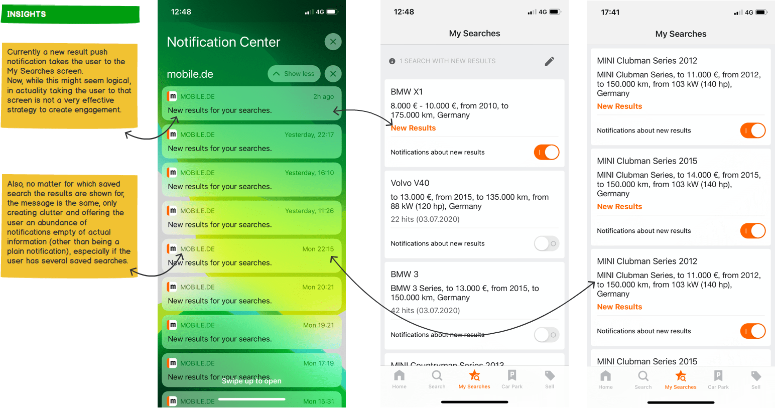
• When a notification for a new result on a saved search is served in the notification center, taping the notification takes the user to the saved search/saved searches list, instead of showing a list with the new items. Once in the app there is no way of knowing what is new, only if the user specifically goes exploring all the ads in his saved search.
• When taping on a push notification served a as a result of a price reduction on a saved item the user is not taken to the item featuring the vehicle with the price reduction, he is taken to the homepage of the app, making it difficult for the user to know which of his items has a price reduction. This approach might only work in the situation in which one particular user has only one saved item.
Improvements
• Display better information in the notification center, with relevant information regarding the updates the user is being notified about. Show information related to which search the push notification is received.
• Enable the user to navigate from the notification received in the notification center to the relevant advertisements that have updates.

Improving home functionality
Insights
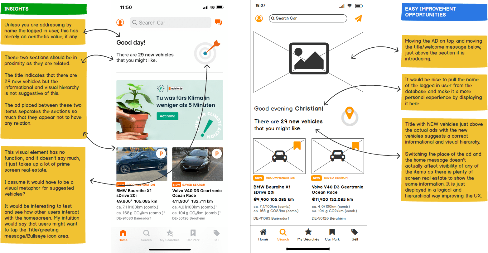
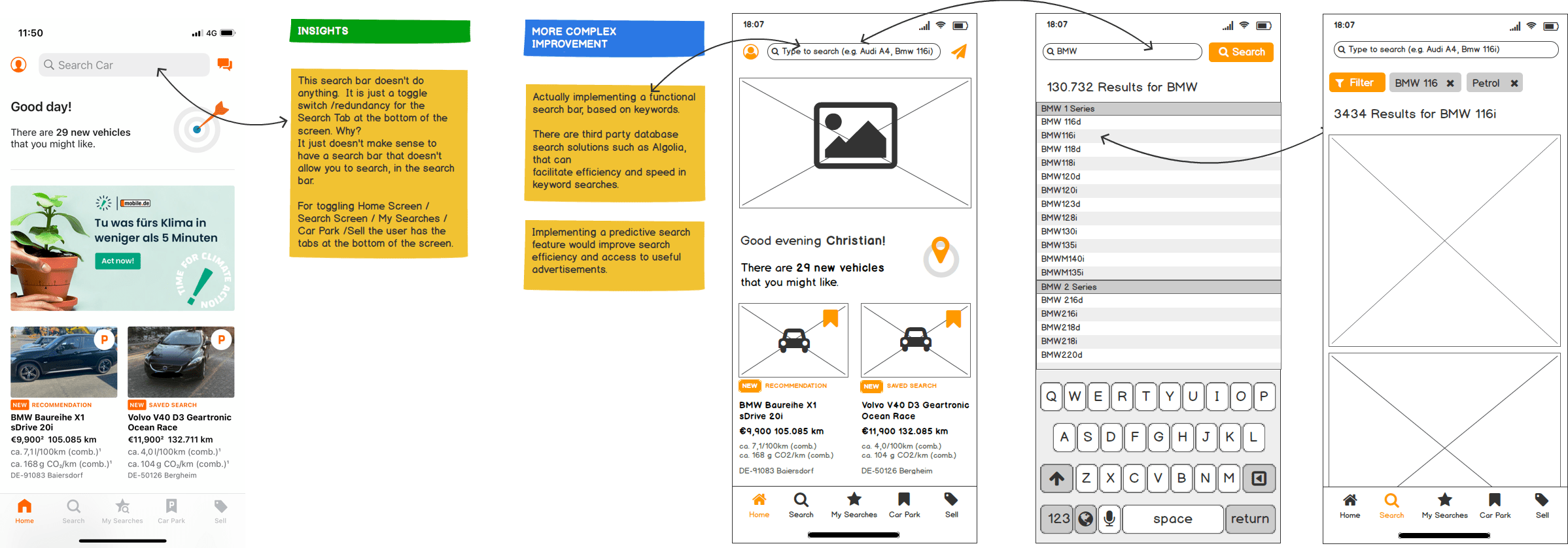
• Search bar is not actually a search bar as it only acts as a toggle for the Search Tab in the navigation.
• Greeting message is not personalized.
• New items information title is disconnected visually from the new items it is introducing.
• ‘Bullseye/Dart’ visual element transmits no meaning although it occupies prime screen real-estate. It does have an appeal to the first time user as it invites taping, although it is not an interactive element.
• The placement of the rather large ad, separates two items that should be adjoining, the new items title and the new items it is introducing.
Improvements
• Create a personal experience by adding the name of the logged in user to the greeting.
• Move the ad on top, and move greeting and new items title below to be adjacent to the new items it introduces.
• A more complex change would be to make the search box actually work as an actual search box, with predictive text input to speed up search and improve the experience.

Improving icons consistency
Insights
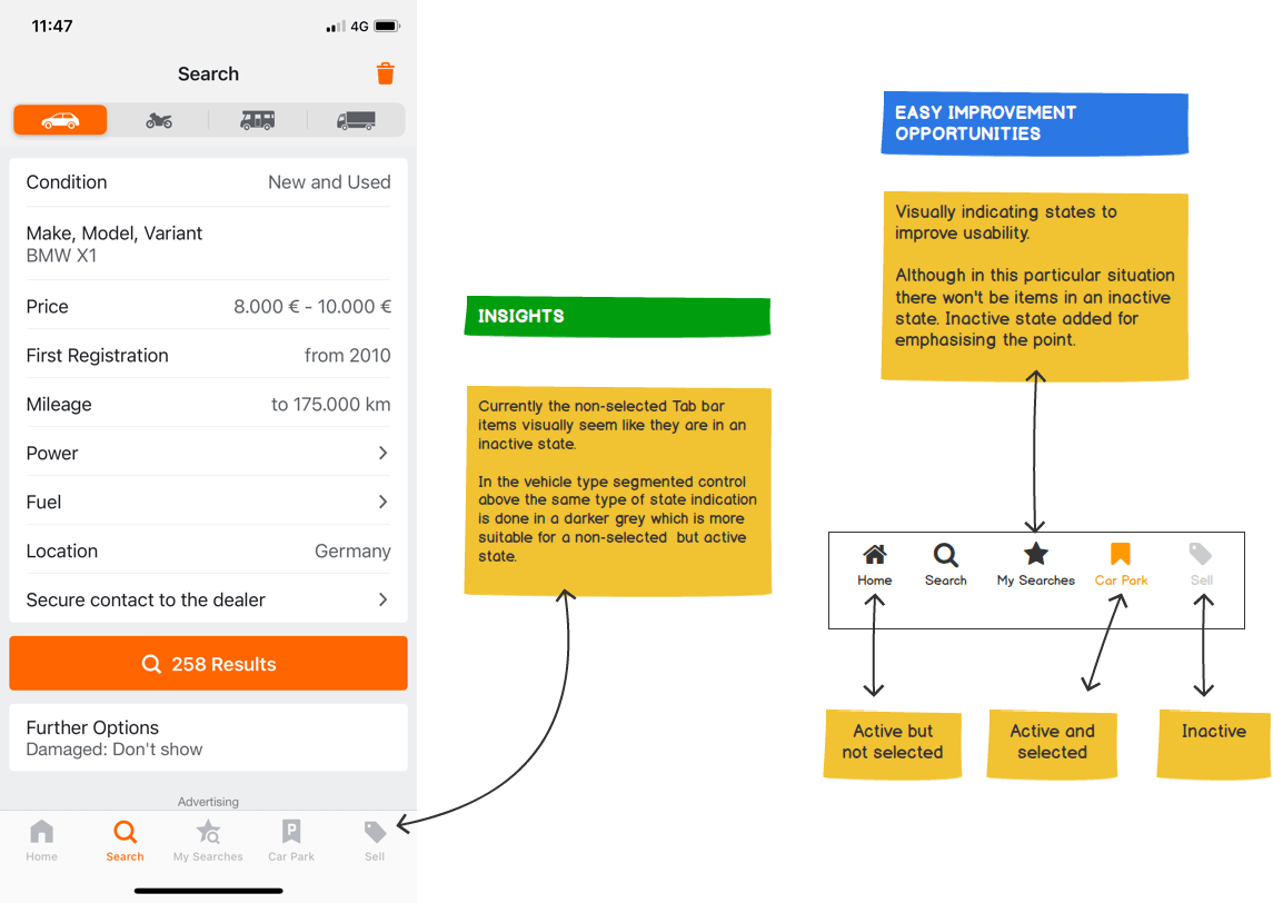
• Although it might not be a big issue, there are slight differences in icon consistency on some items on the home screen. Different icons evoking the same interaction might create confusion, hindering a good user experience.
Improvements
• Make sure identical visual cues point to identical actions/types of information. Related icons or icons doing the same thing should look the same way. Visual consistency in general and icon consistency in this particular situation, improves UX.

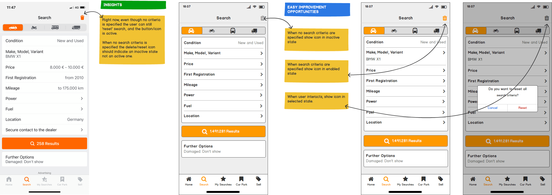
Improving the search experience
Insights
• UX studies have shown that icons work best when paired with labels. Icons for selecting vehicle type in search currently don’t have labels.
• The small height of the tapable area on the category icons makes for a more difficult experience. The screen real estate is plenty enough to accommodate an increase in height making it easier to touch and select without needing too much precision.
Improvements
• A low hanging fruit for improving this aspect is adding text labels and increasing size of the vehicle type selection improving the overall experience. Adding them eliminates ambiguity around the meaning of icons and is easier on new users, shortening the interaction learning curve. Increasing the icon size and touch area will also improve the ease of use.

Improving the search experience
Insights
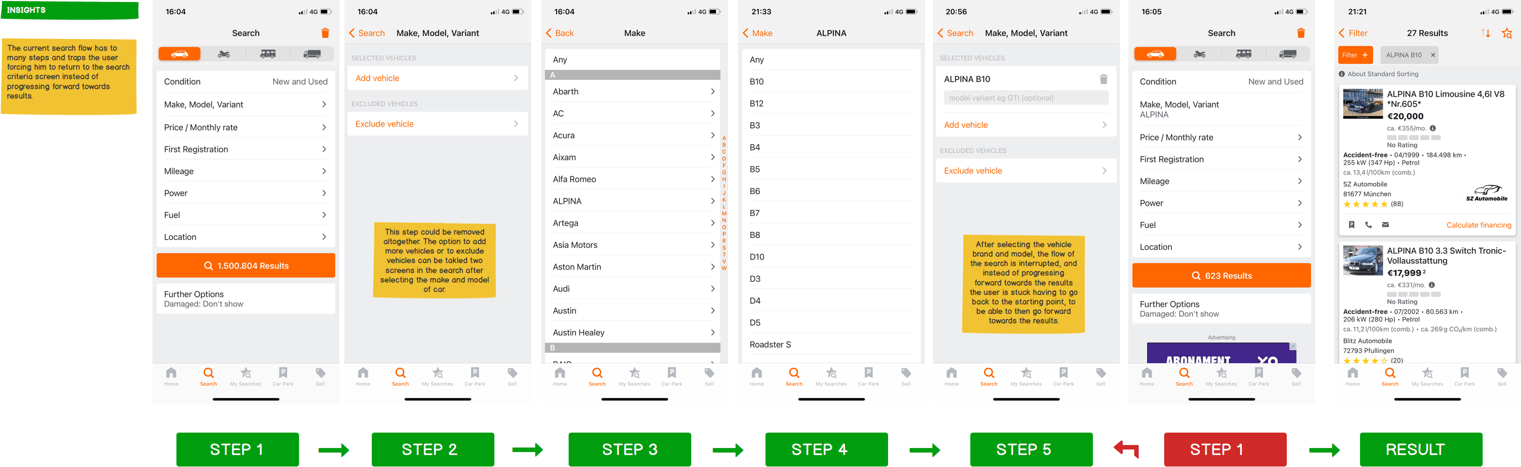
• Currently a user has to take too many steps to get to search results. Ideally the search experience should be progressive, linear and without unnecessary loops (a drill down of a few logical steps). The current implementation does not allow for a linear experience as the user has to loop through the search steps to get to the results.
Improvements
• A way to improve experience is to minimize the number of steps a user has to make to get to a result, as well as eliminating unnecessary actions, leading the user faster and easier to the desired result.
• After getting to results enable the user to filter the search to narrow down options.
Removing superfluous steps from the search experience
Creating a leaner search experience
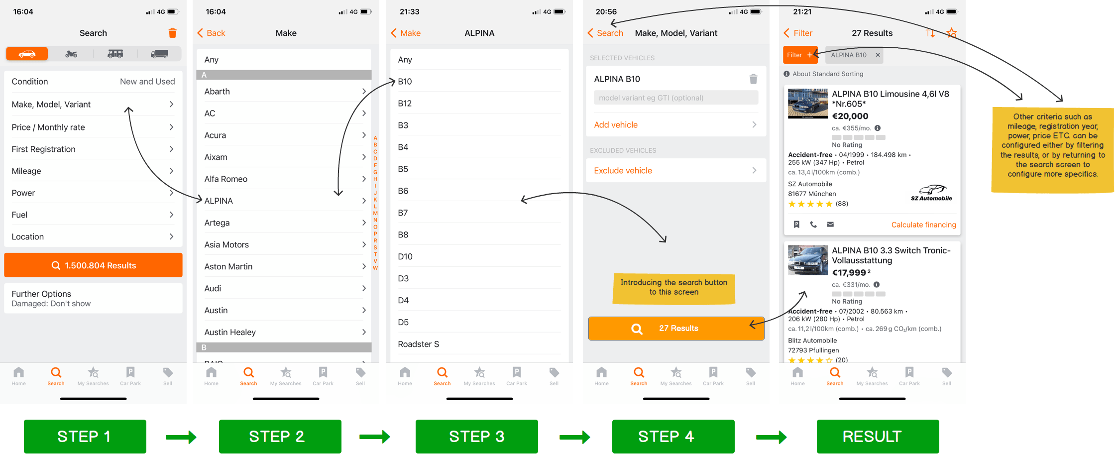
Improving the search experience
Insights
• Having a search bar that is not a search bar rather a redundant toggle for an existing feature is a lost opportunity in improving the search experience.
Improvements
• An avenue worth exploring in making search a more comprehensive experience would be to introduce a predictive text search, helping users get to results quicker, and increasing the chance of conversion.
Making the search bar active and adding predictive text search
Improving visual cues
Insights
• Although it is a more minor aspect in the usability of the app some aspects of visual feedback and visual cues could use some polishing up.
Improvements
• Even out stylistic aspects of visual feedback and cues throughout the app. Make sure the same type of colors indicate the same type of statuses.
Improving informational content in vehicle details and checklists
Insights
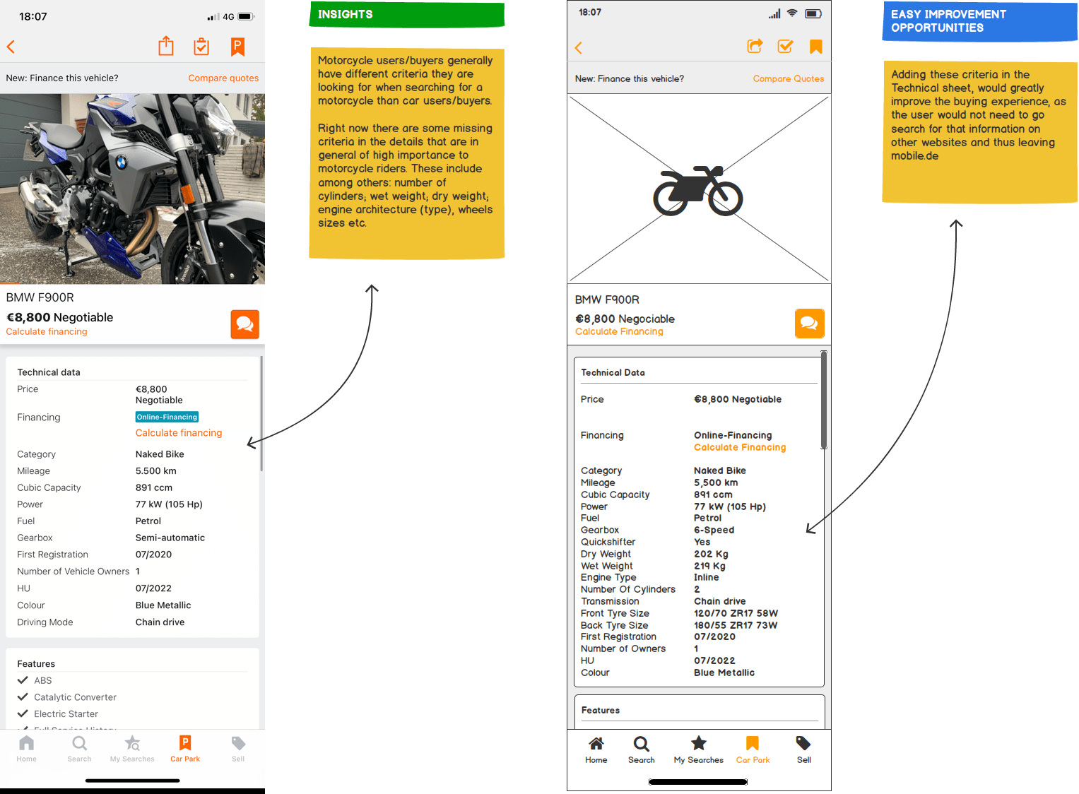
• Technical information and search criteria relevant to a motorcycle buyer, are missing from the technical description of the vehicle. Newer motorcycles have features that are now being added or becoming more mainstream, which have not been available on motorcycles until recently: Quick shifter, Heated Grips, Navigation; Adaptive Lighting etc.
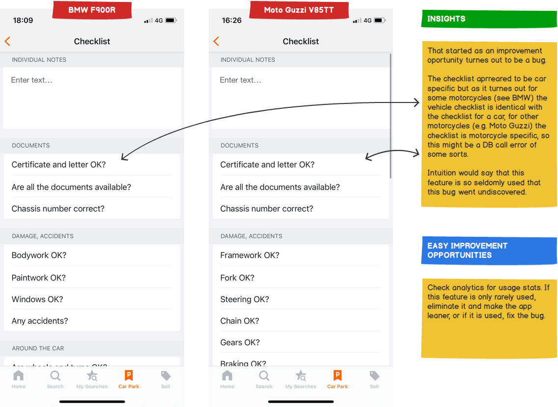
• Motorcycle checklists have functional errors
Improvements
• Enable sellers to add these types of technical information and display the information in the technical descriptions in the detail view of a motorcycle advertisement.
• Fix the issue with the way checklists are being displayed.